Data as Constructed Visibility: Why Metrics Are Not the Same as Meaning
Introduction — The Problem With Treating Data as Truth
Data is often treated as if it begins at the point of measurement.
A dashboard opens. Traffic increases; conversions change. The visible number becomes the default starting point for interpretation.
This is a familiar analytical habit. Once data has been organized into charts, dashboards, reports, and summaries, it can feel like a direct record of what happened. The number appears objective because it is measurable. The report appears authoritative because it is structured.
But data does not show reality directly.
It shows what a system was able to capture, structure, filter, and represent.
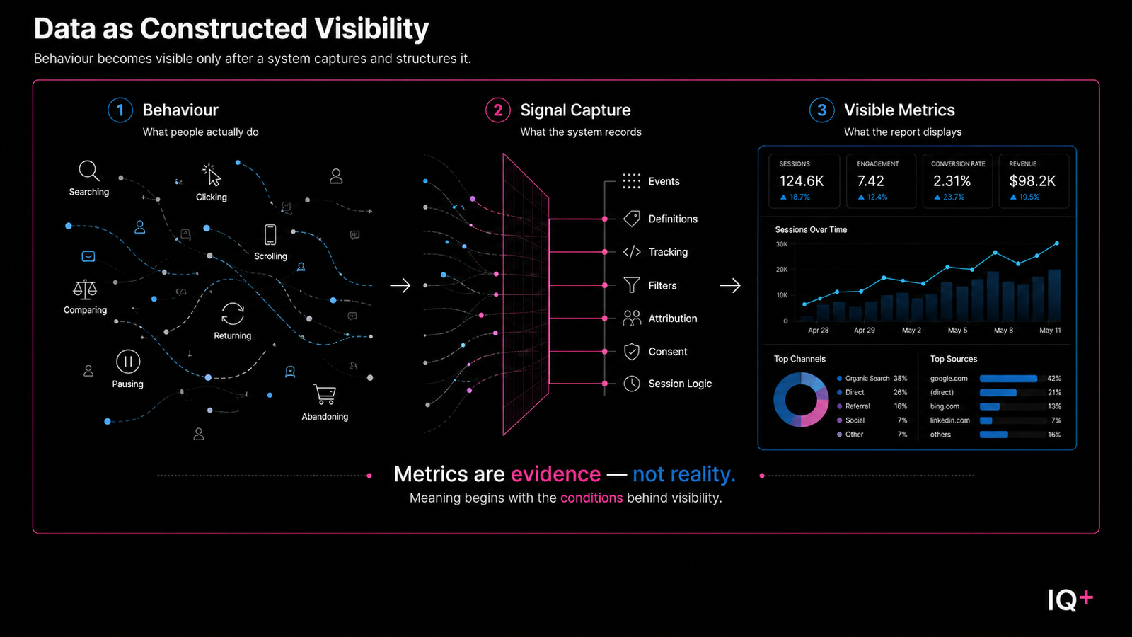
Before a metric appears, behaviour has already passed through a measurement environment. Some actions were tracked. Others were missed. Some events were defined clearly. Others were simplified, grouped, excluded, or distorted by the system recording them.
This means data interpretation often begins too late.
It begins after behaviour has been converted into signals, metrics, and reporting structures. By the time a number appears on a dashboard, several decisions have already shaped what is visible.
The metric is not the behaviour itself. It is the visible artefact of a capture process.
A dashboard may show sessions, clicks, conversions, traffic sources, and engagement rates while still omitting hesitation, comparison, repeated evaluation, unclear intent, offline influence, or actions the system was never configured to observe.
The result is not necessarily false data. The result is partial visibility.
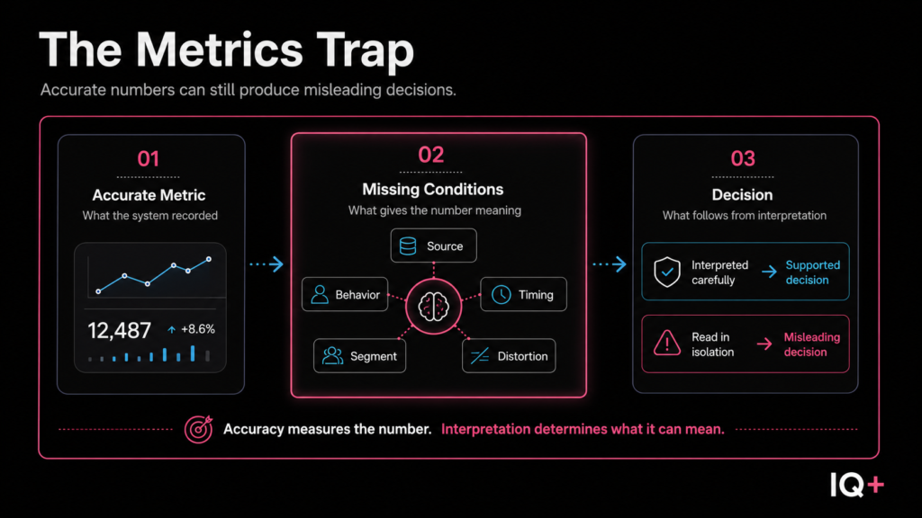
That is the central problem. Data is often interpreted as reported truth when it should first be examined as constructed visibility. A metric may be accurate within the system that produced it, but accuracy does not guarantee meaning.
Responsible data interpretation, therefore, begins before analysis, not after reporting. It asks what behaviour produced the signal, what the system captured, what it excluded, how the metric was formed, and whether that metric provides stable enough visibility to support a decision.
The purpose of this article is not to dismiss metrics, dashboards, or reporting systems. They are necessary tools. But they should not be treated as answers by default. They should be treated as evidence produced through a specific measurement structure.
The movement is simple but important:
from data as reported truth to data as constructed visibility.
Only then can metrics begin to mean something.
Data Begins With Behaviour, Not Metrics
Before data can be interpreted, it has to be produced.
That production does not begin in a dashboard. It begins with behaviour.
A user searches, clicks, scrolls, pauses, compares, returns, abandons, converts, or disappears. Each action may leave a trace, but the trace is not the action itself. It is a recorded signal produced after behaviour has passed through a measurement system.
Search behaviour is one example of this pattern: the action occurs first, and the signal appears only after a system captures part of it.
This distinction is easy to overlook because metrics appear after behaviour has already been translated. By the time the analyst sees a number, the original action has been converted into a format the system can store, count, categorize, and report. The metric appears clean because the process has already removed much of the complexity that gave rise to it.
A click becomes a click-through rate. A visit becomes a session. A purchase becomes a conversion. A pause may become engagement, or it may disappear entirely. A comparison process may be split across devices, channels, or visits until it no longer appears as one coherent behaviour.
The dashboard does not show this transformation. It shows the result of the transformation.
That is why the first interpretive error is often structural. The analyst begins with the metric as if the metric were the original object. Traffic becomes audience interest. Engagement becomes value. Conversion rate becomes page performance. Bounce rate becomes dissatisfaction.
Each conclusion may be possible, but none is automatic.
The metric does not contain the full behaviour. It contains what the system was able to register. This does not make the metric false. It makes the metric conditional.
A metric is a recorded representation of selected behaviour. It is shaped by tracking configuration, event definitions, platform limits, attribution rules, session logic, consent settings, filtering choices, and reporting structure. These conditions determine what becomes visible and what remains outside the report.
For that reason, data interpretation should not begin by asking what the metric means in isolation. It should begin by asking what kind of behaviour the metric is supposed to represent.
This shift matters because behaviour is usually richer than the metric that records it. A long session may suggest attention, confusion, careful reading, comparison, or friction. A short session may suggest disinterest, rapid comprehension, poor fit, or that a user found what they needed quickly. The number is real, but its meaning depends on the behaviour behind it.
The problem is not measurement. Measurement is necessary. Without metrics, behaviour remains difficult to observe at scale. The problem begins when the metric is separated from the behavioural conditions that produced it and then treated as if it explains those conditions on its own.
Metrics are not behaviour. They are artefacts of captured behaviour. An artefact can preserve evidence, reveal patterns, and support comparison — but it is still produced through a process. It reflects the structure that created it as much as the behaviour it attempts to represent.
This is why the distinction between behaviour, signal, metric, and interpretation matters.
Behaviour is what happens. A signal is the trace of behaviour that a system captures in part. A metric is the structured representation of that signal. Interpretation is the meaning assigned after the metric is examined in context.
When those layers are collapsed, analysis becomes weaker. The analyst sees the metric and moves directly to explanation, even though the explanation may be built on a partial signal, a narrow definition, or a reporting structure that made some behaviour visible while excluding other behaviour from view.
A stronger approach keeps the layers separate.
It asks what happened before the metric appeared. It asks what the system captured from that behaviour. It asks how the captured signal was structured into a measurable form. Only then does it ask what the metric may reasonably suggest.
This is a foundational discipline in data interpretation: correctly repositioning metrics.
They are not neutral records of reality. They are not complete explanations of user behaviour. They are not strategic conclusions waiting to be read from a dashboard. They are evidence.
And like all evidence, they require examination before they can support a decision.
Visibility Is Constructed, Not Complete
If metrics are artefacts of captured behaviour, then visibility is never neutral.
A system does not make everything visible. It makes certain things visible. What appears in a report depends on what the system was designed to observe, how behaviour was translated into events, which actions were counted and which were ignored, and how the resulting signals were organized for analysis.
This means visibility is not the same as reality. It is a structured view of reality produced through measurement choices.
Every analytics system creates this kind of view. It defines what counts as a session, engagement, conversion, source, returning user, and meaningful interaction. These definitions may be necessary, but they are still definitions. They decide which parts of behaviour become visible and which parts remain outside the frame.
The danger is that once this visibility is organized into a dashboard, it can look complete.
A dashboard gives structure to information. It arranges metrics into categories, charts, time periods, comparisons, and summaries. That structure is useful because it makes large amounts of behaviour easier to inspect. But the same structure can create a false sense of completeness. Because the report is orderly — fields filled, categories clear, trend lines moving — it can appear as if the system has shown everything that matters.
It has not.
This is the dashboard completeness illusion. The mechanism is not merely that some signals were missed. It is that the visual organization of a dashboard — its charts, rows, categories, and summaries — gives the appearance of a coherent and finished record. The fields are populated. The numbers add up. The interface is navigable. All of this creates confidence in the report’s completeness before the analyst has examined the conditions that shaped it or the behaviour the system was not configured to observe.
What is absent from a report can shape interpretation as much as what is present. When visibility is partial, the analyst is not only reading what the system reports. The analyst is also working within what the system cannot show.
This distinction is especially important in digital environments because user behaviour rarely follows a single visible path. People compare, delay, return, search elsewhere, scan without clicking, abandon for reasons unrelated to the page, or convert after a sequence of interactions that no single report fully preserves.
The measurement system simplifies this complexity so it can be recorded. That simplification is not automatically a failure. Without simplification, behaviour would be difficult to measure at all. The problem begins when the simplified view is mistaken for the full condition.
Visibility can also be distorted during capture and structuring.
An event may be defined too narrowly. A conversion may be attributed to the last visible channel rather than the broader path that shaped the decision. A session may be split by device changes, consent limits, browser restrictions, or tracking gaps. Engagement may be counted through proxy actions that do not fully reflect attention, comprehension, trust, or intent.
The issue is not that the data is useless. The issue is that the visible data has conditions.
Google Analytics makes some of these reporting conditions visible through its data quality indicator, which can show whether a report uses all available data, applies thresholding, or relies on sampled data. This reinforces the broader analytical point that a visible metric should be interpreted in relation to the conditions under which it was produced.
It was produced by a system with boundaries. It was shaped by definitions. It was filtered through collection rules. It was organized through reporting logic. It was made readable by reducing behaviour into structured signals.
That is why visibility must be examined before interpretation becomes too confident.
The analyst has to ask what the system made visible, what it made invisible, and what may have changed during the capture process. This does not mean every missing signal can be recovered. Often it cannot. But recognizing the limits of visibility changes how strongly a metric should be interpreted.
Data does not arrive as a complete record. It is made visible through a measurement system. The clearer the report appears, the more important it becomes to ask how that clarity was produced.
Metrics Can Be Accurate and Still Misleading
The problem with metrics is not always accuracy.
A number can be technically correct. The tracking may fire properly. The event may be counted. The dashboard may report the right total. The calculation may be valid within the system that produced it.
And still, the interpretation can be weak.
This is where data interpretation becomes unstable. Accuracy is often treated as if it settles the question of meaning. If the number is correct, the conclusion feels justified. But a metric can only report what it was structured to measure. It does not automatically explain the condition behind the measurement.
A metric can be accurate and still incomplete. It can be precise and still narrow. It can be visible and still poorly understood.
This matters because strategic decisions often move too quickly from metric to conclusion. Traffic is up, so visibility must be improving. Engagement is down, so the content must be weak. The conversion rate is low, so the page must be failing. A dashboard shows movement, and the movement is treated as an explanation.
But movement is not meaning.
A metric indicates that something changed or was counted under specific conditions. It does not, by itself, explain why that change occurred, what produced it, what was omitted from view, or whether the signal is strong enough to support the decision being made from it.
The sequence matters:
behaviour → signal capture → metric formation → interpretation → decision
This sequence also reflects the broader AnalytIQs+ framework: behaviour becomes signal, signal becomes interpretation, and interpretation shapes decisions.
When this sequence is respected, the analyst does not begin with the number as an answer. The analyst asks what behaviour produced the signal, how that signal was captured, how it became a metric, and what the metric can reasonably support.
When the sequence is collapsed, the metric absorbs too much responsibility.
It is asked to describe behaviour, explain intent, diagnose performance, and justify action, even though it may only represent one visible part of a larger condition. This is how technically accurate data can produce misleading decisions. The weakness is not necessarily in the number. The weakness is in the meaning assigned to it.
Consider traffic.
An increase in page visits may be accurately recorded. The page may genuinely have received more sessions than before. But that does not automatically mean the page is attracting the right audience, creating value, improving trust, or supporting the decision path.
The traffic may come from low-intent users. It may come from irrelevant referrals. It may come from curiosity rather than need. It may come from a query mismatch, where users arrive expecting one thing and find another. The number shows increased visibility, but it does not prove useful visibility.
The metric is accurate. The interpretation may still be wrong.
The same issue appears with the conversion rate.
A low conversion rate may be correctly calculated. The page may have received visits, and only a small percentage may have completed the desired action. But the conclusion does not follow automatically. Low conversion does not always mean failure. It may indicate hesitation, comparison, early-stage research, price sensitivity, unclear positioning, insufficient trust, or a longer decision cycle.
It may also indicate that the page is serving a role that conversion rate alone cannot fully describe.
A user may return later. A user may compare the offer against alternatives. A user may need another article, another proof point, another visit, or another channel before acting. In that case, non-conversion is not an empty behaviour. It may still contain a signal value.
The metric indicates that conversion did not occur during that visible moment. It does not fully explain what the user was doing.
This is why accuracy cannot be the final standard for interpretation. Accuracy indicates whether the number was produced correctly within the measurement system. It does not tell the analyst whether the number has been understood correctly within the decision context.
Those are different questions.
A metric can answer, “What did the system record?” It cannot automatically answer, “What does this mean?” It cannot automatically answer, “Why did this happen?” It cannot automatically answer, “What should we do next?”
Those questions require interpretation. Interpretation requires context. Context requires examining the conditions behind the signal.
Without that examination, metrics become persuasive too early. Their numerical form gives them authority before their meaning has been tested. An accurate number can create a false sense of certainty, especially when it appears inside a polished report or dashboard.
That work belongs to interpretation.
The analyst must slow the movement from number to conclusion. Before deciding what the metric means, the analyst has to ask what the metric represents, what it excludes, and whether the visible signal is stable enough to support the decision being considered.
This does not weaken the data. It strengthens it.
The goal is not to distrust every metric. The goal is to prevent metrics from being used beyond their interpretive capacity. A metric should not be rejected because it is partial. Most metrics are partial. But it should be read with an understanding of what kind of partiality it contains.
Some metrics are incomplete because signals were missed. Some are distorted because tracking or attribution shaped the result. Some are narrow because the metric captures an outcome but not the process that led to it. Some are unstable because the pattern is temporary, seasonal, or driven by conditions outside the report.
These distinctions matter because different signal problems require different responses. Missing context may require deeper investigation. Distorted attribution may require measurement review. Audience mismatch may require repositioning. Premature interpretation may require restraint.
But if every metric is treated as self-explanatory, those distinctions disappear.
The decision becomes a reaction to the visible number.
That is the central mechanism behind misleading metrics. They do not need to be false to mislead. They only need to be interpreted without enough attention to the conditions that produced them.
A metric becomes meaningful only after it is placed back into the sequence that created it — behaviour, signal capture, metric formation, interpretation, decision. When that sequence is respected, the number loses some of its false authority and gains analytical value.
Signal Integrity Comes Before Interpretation
If visibility is constructed, then interpretation cannot begin with the visible metric alone.
Before data can support a decision, the signal has to be examined. The analyst has to ask what was captured, what was missed, what may have been distorted, what context is absent, and whether the metric provides sufficiently stable visibility to support the conclusion drawn from it.
This is the practical discipline of signal integrity.
Signal integrity is the bridge between measurement and decision-making. It determines whether a recorded signal can responsibly carry the meaning being assigned to it. Without that bridge, the sequence collapses: behaviour becomes a metric, the metric becomes a conclusion, and the conclusion becomes a decision before the signal has been tested.
Signal integrity does not mean the data is perfect. It means the signal is understood well enough to be used responsibly. A metric need not capture everything to be useful, but its limits must be known. The analyst has to understand the distance between the observed behaviour and the metric that represents it.
That distance is where interpretation can weaken.
If the signal is incomplete, the metric may underrepresent important behaviour. If the signal is distorted, the metric may exaggerate or misclassify what happened. If the signal is unstable, the pattern may not be strong enough to support a decision. If the signal lacks context, the metric may invite a conclusion that feels clear but is not yet justified.
These are not minor technical concerns. They shape the quality of the decision that follows.
A decision based on incomplete visibility may respond to the wrong problem. A decision based on distorted capture may optimize for a misleading pattern. A decision based on unstable signals may treat temporary movement as structural change. A decision based on missing context may mistake measurement for explanation.
This is why the analyst should not ask only whether the metric moved. The analyst should ask whether the movement can be trusted, what conditions produced it, and whether the visible signal is strong enough to carry strategic weight.
This does not make the analysis slower for the sake of caution. It makes the analysis more precise. Without this step, interpretation becomes reactive. The dashboard shows movement, and the decision follows. With signal integrity, the analyst creates a pause between visibility and conclusion.
That pause is where better interpretation happens.
It allows the analyst to separate what is visible from what is assumed. It forces the metric to be examined as evidence rather than accepted as an answer. It protects the decision from being built on a signal that is too incomplete, too distorted, too narrow, or too unstable to carry the meaning assigned to it.
Signal integrity brings uncertainty back into the analysis. It asks whether the event was defined correctly, whether the measurement system captured the behaviour consistently, whether the metric is being used for the purpose it can actually support, and whether important behaviour is missing from view.
These questions do not reject data. They protect data from being overinterpreted.
Signal integrity is therefore not a technical afterthought. It is the condition that determines whether interpretation can be trusted.
Before asking what the data means, the analyst must ask whether the signal is strong enough to support the decision.
Data Becomes Useful Only After Its Conditions Are Examined
What changes when data is understood as constructed visibility rather than reported truth?
The analyst’s starting questions change. Rather than starting with what the dashboard shows, the analysis begins with how the visible output was produced. Before a metric can carry interpretive weight, the signal chain that created it must be examined: what behaviour generated the signal, what the system captured and excluded, how the metric was formed from that signal, and whether the resulting number is stable enough to support the decision at hand.
This sequence is not a procedural checklist. It is a discipline of restraint. It holds the metric in place long enough for examination before it becomes a conclusion.
The result is not a weakened relationship with data. It is a more precise one. When the conditions behind a signal are understood, the metric does not lose value — it becomes more reliably useful because its limits are visible. An incomplete signal, once recognized as such, can still inform, but cannot be asked to explain more than it shows. A distorted capture, once identified, changes what kind of decision is warranted. A narrow metric, understood as narrow, can direct attention without misdirecting interpretation.
The practical consequence is this: interpretation begins not from the dashboard, but from the conditions that produced it. This is not an obstacle to analysis. It is the condition that makes analysis trustworthy.
Data interpreted this way becomes evidence: bounded, conditional, and useful precisely because its conditions are known.
The questions raised in this article — what the signal chain is, how visibility is constructed, why accurate metrics can still mislead, and what signal integrity requires — are the opening questions of the Data Interpretation lens. The articles that follow examine what happens when those questions are brought to bear on specific analytical conditions: how pattern stability is assessed, how distortion enters measurement, how visibility gaps can be located, and how interpretation remains disciplined across different signal types. These are the working conditions of reliable data interpretation — the analytical infrastructure that separates a decision built on examined evidence from one built on a confident but unexamined number.
If you enjoyed this analysis and would like to continue exploring these ideas, subscribe to receive new AnalytIQs+ essays and new publication updates by email.