The Metrics Trap: How Accurate Numbers Can Still Mislead You
Introduction — The Illusion of Precision
I understand why dashboards feel convincing.
They are clean. They are organized. They turn activity into numbers, charts, percentages, and trend lines. They give the impression that a situation has already been measured, structured, and made visible. The ambiguity seems to shrink once the number appears.
But visibility is not the same as understanding.
This is where data interpretation becomes necessary, and where the metrics trap begins. A number can be technically accurate and still lead to a weak decision if it is separated from the context that gives it meaning. The metric may be correct. The reporting may be precise. The dashboard may be configured properly. And still, the conclusion drawn from that number may be incomplete, misleading, or directionally wrong.
That distinction matters because numbers carry a certain authority. Once something is counted, it feels more objective. Once it appears in a report, it feels more reliable. Once it is shown in a chart, it feels easier to trust.
But a metric does not explain itself.
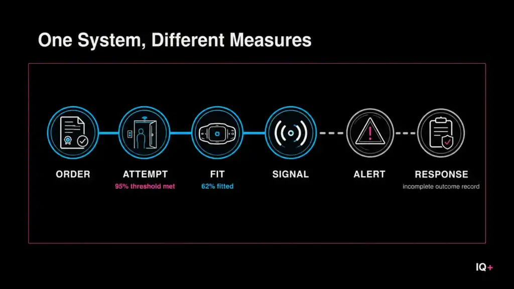
The UK electronic-monitoring case makes this problem concrete: a 95% attempt target could be met while the wider monitoring outcome remained much less complete.
It only tells us that something was captured, calculated, or observed within a particular measurement system. To become useful, that number has to be interpreted. It has to be connected to behaviour, source, timing, segment, context, and the decision it is supposed to support.
Without that interpretive layer, metrics can create the appearance of clarity while hiding the conditions that make the number meaningful.
The problem is not measurement. Metrics are necessary. Without them, organizations rely too heavily on impressions, assumptions, selective memory, and whatever feels most obvious in the moment. Data gives structure to observation. It allows patterns to be compared, tracked, questioned, and revisited over time.
The problem begins when measurement is treated as the answer rather than the beginning of inquiry.
This is an easy mistake to make. A clean number can make a messy situation feel settled. A precise report can make a weak interpretation feel well supported. But in data interpretation, accuracy is only the starting point. A correct number can still support the wrong conclusion if it is read too quickly, too narrowly, or without the conditions that shaped it.
Accuracy matters.
But accuracy is not truth.
Accuracy Is Not Truth
Accuracy matters, but it can easily be misunderstood.
When we say a number is accurate, we usually mean that it was captured, calculated, or reported correctly within a defined system. The tracking worked. The formula was right. The report pulled the expected value. Nothing obvious appears broken.
That matters. A number that is collected incorrectly is not a useful foundation for analysis.
But accuracy does not tell us what the number means.
A conversion rate may be accurate. A revenue figure may be accurate. A traffic increase may be accurate. The question is not only whether these numbers were counted correctly. The stronger question is whether they are being interpreted in a way that reflects the situation behind them.
That is a different kind of test.
This distinction is easy to miss because accurate numbers feel safe. If the number is correct, the conclusion can seem reliable. If the chart is precise, the interpretation can seem sound. If the dashboard is configured properly, the analysis can feel complete.
But a metric is never separate from the system that produced it.
Every measurement system makes choices. It decides what is captured and what is excluded. It defines what counts as an event. It groups users in particular ways. It translates behaviour into categories, labels, sessions, conversions, clicks, views, and other measurable forms.
Those choices shape what the number can show.
So a metric can be accurate inside the measurement system and still fail to represent the broader condition clearly. It can be technically correct while remaining too narrow, too partial, or too detached from the decision being made.
This is why accuracy and interpretation need to be treated as separate layers.
Accuracy asks a narrow but necessary question:
Was this number produced correctly?
Interpretation asks a wider set of questions:
What does this number represent? What does it leave out? What conditions shaped it? What behaviour sits behind it? What decision can it responsibly support?
Without that second layer, even a technically correct number can become directionally useless. It may show movement without explaining cause. It may show scale without showing quality. It may show activity without showing whether that activity matters.
The number is not the meaning.
The number is the entry point into meaning.
The Problem With Isolated Metrics
The metrics trap becomes especially convincing when numbers are read in isolation.
This is one of the most common problems in reporting. A number is pulled out of the dashboard and treated as if it can stand on its own: traffic increased, engagement declined, conversions improved, average position changed, revenue rose, leads decreased.
Each statement may be accurate.
None of them is complete.
A traffic increase can mean several different things. It may mean the site is gaining stronger visibility from relevant searches. It may mean one page is attracting low-intent visitors. It may mean a campaign produced a temporary spike. It may mean traffic shifted from one source to another. It may even mean the site is getting more attention without getting closer to the outcome that matters.
The number alone cannot tell us which of those realities we are looking at.
The same is true of a conversion decline, a ranking shift, or a change in engagement. The metric may show movement, but the movement still has to be interpreted. Where did it happen? Which segment changed? What source produced it? What time frame are we looking at? What behaviour sits underneath the change?
Without those surrounding conditions, the metric is too thin.
This is where isolated reporting creates a subtle risk. A clean number can make the analysis stop too early. It gives the impression that the situation has already been understood, when really only one visible surface has been named.
The metric appears to clarify the situation, but it may only clarify the part that was easiest to count.
That is why segment, source, and timing matter so much. A metric averaged across all traffic may look stable while one segment is weakening and another is improving. A number read across the wrong time frame may look like a trend when it is only noise. A metric counted without source context may confirm what the analyst expected rather than reveal what actually happened.
Google Search Console makes this limitation explicit in its guidance on performance data: results can be aggregated by property or by page, and those different reporting structures can produce different totals. The metric remains valid within the selected view, but interpreting it requires understanding how that view was constructed.
This is not a rejection of metrics.
It is a warning against asking a metric to do more than it can do alone.
A number can be accurate and still incomplete. It may show that something changed without showing whether the change matters. It may show improvement without showing whether the improvement is useful. It may show decline without showing whether the decline is harmful.
The danger is not always that the number is wrong.
The danger is that reading it without enough context can make a weak interpretation feel well supported.
How the Metrics Trap Creates False Confidence
Precision can reduce curiosity.
That may sound strange, because precision is usually treated as a strength. And it is a strength — a vague report is never better than a precise one. But precision creates its own risk.
When a number appears exact, the situation can feel more settled than it really is. A dashboard provides a value. A chart shows a line. A percentage moves up or down. The result feels concrete enough to act on.
This is where the analyst has to slow down.
The more specific a number looks, the easier it becomes to forget that interpretation is still required. A precise metric can make a partial reading feel complete. It can make a surface-level explanation feel more disciplined than it actually is.
This is also where reporting is often confused with analysis.
Reporting describes what is visible. Analysis asks what the visible pattern means. These two tasks are related, but they are not the same. A report may show that a metric changed. Analysis has to ask why it changed, what produced the movement, whether the change is meaningful, and what decision should follow.
Without that second layer, precise reporting can create weak certainty.
A team may see a decline and assume performance is deteriorating, when the decline actually reflects a shift away from low-quality sources. Another team may see growth and treat it as validation, when the growth represents visibility that does not serve the intended purpose.
In both cases, the number reassures when it should provoke questions.
That is the illusion of precision. A metric feels clear because it is specific, but specificity is not the same as interpretive strength. A precise number can still be attached to a weak reading of the situation.
Strong analysis does not reject precision.
It disciplines it.
It refuses to let the number settle the question before the question has been properly asked.
Reading Metrics as Signals
A more disciplined way to avoid the metrics trap is to treat metrics as signals, not conclusions.
A signal does not end the analysis, it begins it. It suggests that something may be happening, but it does not explain the full situation on its own.
This shift matters because it changes the starting point. Instead of asking, “What does this metric say?” and letting the number answer the question by itself, we ask something more careful:
What might this number be signalling, and what else needs to be examined before we act on it?
That question forces movement.
A traffic increase becomes the beginning of inquiry, not the conclusion. What kind of traffic increased? From which source? To which pages? With what intent? Did the increase support the purpose of the site, or did it only create more activity?
A content page gaining impressions without clicks raises a different set of questions. What queries is it appearing for? At what position? In what search environment? Is the gap between impressions and clicks a problem to solve, or is the page being surfaced for searches where the user does not yet need to click?
The metric does not produce the answer.
It defines the shape of the inquiry.
This is also why metrics become stronger when they are read in relationship to one another. A single number can mislead when it stands alone. The same number, read beside a related indicator, can become more useful.
Sessions mean more when source composition is examined. Conversion rate means more when it is read beside audience quality, return behaviour, or average transaction value. Impressions mean more when they are connected to query type, position, and the role of the page inside the content system.
Read this way, no metric is meant to carry meaning on its own — each one earns its meaning from the system around it: the behaviour, the source, the timing, and the decision the analysis is meant to inform.
The metric is not the strategy.
It is evidence within the strategy.
The Clarity vs. Meaning Check
One practical way to avoid the metrics trap is to separate clarity from meaning before moving from observation to decision.
Clarity tells us what is visible.
Meaning tells us whether what is visible has been interpreted carefully enough to support action.
Those are not the same thing.
A metric can be clear without being meaningful. It can be easy to read, easy to compare, and easy to report while still being too incomplete to guide a decision. This is why a clean dashboard is useful, but not sufficient. It may show the number clearly. It may not show whether the number has been understood.
Before treating a metric as evidence, I would slow the process down with five questions:
01
Metric
What is the number?
Identifies the metric being measured and the visible value being reported.
02
Source
Where did it come from?
Locates the number inside the system that captured and reported it.
03
Behaviour Represented
What does it represent?
Connects the metric to the action, state, pattern, or behaviour behind it.
04
Possible Distortion
What could mislead the reading?
Tests for timing, segment, source, tracking, or definition changes.
05
Decision Use
What can it inform?
Defines the decision the metric can responsibly support.
These questions are not a formula. They are a discipline.
They create a deliberate pause between what the data shows and what the analyst concludes. That pause matters because weak interpretation often happens quickly: a number appears, the pattern seems obvious, and the decision follows before the surrounding conditions have been examined.
The first question identifies what is being measured. The second grounds the metric in a source, which immediately raises the issue of limits. The third moves from the number to the behaviour behind it — the interpretive step most often skipped in routine reporting.
The fourth question introduces caution. It asks what could distort the reading: seasonality, audience mix, tracking changes, definition shifts, attribution logic, campaign timing, or a change in how the data was collected.
The fifth question connects the metric to its decision context. This is where interpretive quality can actually be tested. A metric may be useful for monitoring but too thin for diagnosis. Another may help identify a problem but not explain the cause. Another may require segmentation before it can support any serious decision.
Not every number deserves the same decision weight.
The Clarity vs. Meaning Check makes that distinction explicit. It prevents analysis from stopping at visibility and forces the metric to earn its role in the decision.
Conclusion — Metrics Are Starting Points
Escaping the metrics trap begins by treating a metric as a starting point rather than an answer.
The analysis does not stop when the dashboard is read. It starts there. The number becomes an indication that something may be happening, not proof that interpretation is already complete.
That distinction changes the role of reporting.
A report that only presents numbers invites people to act on incomplete information. It may be accurate, clean, and useful as a record of what was observed. But without context, it does not fully support the decision that comes next.
A stronger report does more than display the number. It shows the conditions required to interpret it: where the number came from, what behaviour it represents, what may have shaped it, and what decision it can responsibly inform.
Accuracy is still necessary. A number that was captured incorrectly or reported poorly is not a useful starting point. But accuracy is the floor, not the ceiling.
A correctly measured number still has to be interpreted. It has to be connected to the behaviour behind it, the source that produced it, the conditions that may distort it, and the decision it is expected to support. That interpretive work is where data interpretation becomes useful.
Not in measurement alone.
Not in reporting alone.
But in the gap between what the number shows and what it can responsibly mean.
Metrics are not the problem. The problem is the assumption that a precise number closes that gap by itself. In strong analysis, the metric opens the inquiry. It does not end it.
Until that gap is examined, even accurate data can mislead.
If you enjoyed this analysis and would like to continue exploring these ideas, subscribe to receive new AnalytIQs+ essays and new publication updates by email.