Data-Driven Decision Making Begins Before the Decision
Data-driven decision making is usually described as the practice of using evidence rather than intuition alone. We collect information, analyze it, identify patterns, and let what we find guide the choice. In my view, that description starts too late.
Before a metric reaches a dashboard, a report, a regulator, or an executive meeting, someone has already made decisions about the evidence itself. Which observations belong together? Which population should they represent? Which measures deserve the most weight? What benchmark should define success or failure? These choices are easy to overlook because they happen before the final number appears, but they can materially change what that number seems to mean.
Four recent cases make this visible from very different directions. The FDA and Sarepta Therapeutics disagreed over how broadly a cluster of fatal safety events should be grouped. Nielsen’s transition toward Big Data + Panel measurement showed how representation, modelling, and weighting can change audience estimates. Klarna found that strong efficiency metrics did not necessarily capture everything management meant by service quality. Tesla and Waymo illustrate how safety conclusions depend on the benchmark used to construct the comparison.
These are not equivalent cases, and I am not going to compare their outcomes as though they were. What connects them is narrower: each shows a different interpretive decision occurring before evidence becomes a basis for data-driven decision making. That is where I want to begin.
FDA and Sarepta: When Grouping Changes the Signal
In July 2025, the FDA and Sarepta Therapeutics were looking at a small but consequential set of safety events. Two non-ambulatory patients with Duchenne muscular dystrophy had died from acute liver failure after receiving Sarepta’s Elevidys gene therapy. A third fatal acute-liver-failure case occurred in a non-ambulatory patient receiving a separate investigational Sarepta therapy for limb-girdle muscular dystrophy, which used the same AAVrh74 vector serotype as Elevidys.
The deaths themselves were not the central interpretive disagreement. The disagreement was about which deaths belonged together analytically.
The FDA treated the common vector platform and common acute-liver-failure outcome as sufficiently important to investigate the events as a broader safety signal. On July 18, it placed related limb-girdle trials on clinical hold, revoked Sarepta’s platform-technology designation, and requested that Sarepta suspend all Elevidys distribution while the agency investigated.
Sarepta initially drew the boundary differently. The company argued that the evidence did not establish a new or changed safety signal in ambulatory Elevidys patients, emphasizing differences in patient population, disease, therapy, dose, and manufacturing process. Sarepta did not dispute that the third death mattered; it disputed how far that observation should be generalized.
This is a useful example of data aggregation because neither interpretation rests on a different set of fatal events. The analytical divergence begins with the boundary placed around the observations. Aggregate the cases around a shared vector and liver-failure phenotype, and the potential signal becomes broader. Segment them by patient population, disease, product, dose, and manufacturing context, and the apparent scope becomes narrower.
That difference mattered operationally. Sarepta eventually paused all U.S. shipments while further review occurred. The FDA later allowed ambulatory shipments to resume. By November 2025, the agency had approved a boxed warning for serious liver injury and acute liver failure while restricting the Elevidys indication to ambulatory DMD patients aged four and older.
I would be careful about reading that sequence as proof that either side’s original interpretation was simply correct. The public record does not contain the complete patient-level dataset, and three fatal cases constitute a sparse evidentiary base. A regulator deciding whether to permit treatment and a manufacturer evaluating its own product also face different consequences if they underestimate risk. The stronger lesson is methodological: before we can interpret a signal, we have to decide what belongs inside it.
Nielsen: When Representation Changes the Number
For data-driven decision making, the Nielsen case moves the problem one stage further. Once we have decided which observations belong in a dataset, we still have to decide what population those observations represent.
Nielsen’s Big Data + Panel national television measurement received Media Rating Council accreditation in January 2025. The system combines Nielsen’s probability-based people panel with much larger sources of behavioural data, including return-path information from set-top boxes and automatic-content-recognition data from connected televisions. Nielsen subsequently moved toward using the hybrid system as its principal national ratings currency for the 2025–26 television season.
At first glance, the advantage seems straightforward: more observations. Traditional panel measurement starts with a comparatively small group of known people and extrapolates their behaviour to a wider population. Big Data + Panel introduces device-level observations from roughly 45 million U.S. households and 75 million devices while retaining the panel to help assign demographic and person-level characteristics.
But more observations do not remove the need for interpretation in audience measurement; they create different interpretive problems. A television knows that something was displayed. That does not tell us who watched it. Device data must be connected to people, demographic characteristics, population estimates, and weighting systems before it becomes an audience estimate. The measurement architecture has to answer questions such as: which devices enter the dataset, how households are mapped to individuals, how underrepresented groups are corrected, and what population estimate the observations should be weighted against.
Those choices became particularly visible during the MRC’s continuing review in 2026. Concerns emerged around representation, demographic assignment, weighting, universe estimates, and variability between panel-only and Big Data + Panel results. Nielsen subsequently adopted an independent universe-estimate source and developed changes to demographic modelling and weighting. Its accreditation remained in place as of the MRC’s May 2026 update, with further changes still pending.
What interests me here is that neither measurement system gives us direct access to some perfect underlying number called “the audience.” Both are estimates. The panel estimates the wider population from a comparatively small group of known individuals. The hybrid system observes vastly more devices but requires additional modelling to infer the people behind them and the population they represent.
Those methodological differences can produce materially different results. A December 2025 analysis supplied by a major television network and reported by The Current found substantial variation between panel-only and Big Data + Panel estimates, while the MRC itself identified unusual demographic movement and estimated variability that warranted corrective investigation. That does not mean the panel was right and big data was wrong. Nielsen was also changing other parts of its measurement system, including out-of-home measurement, which complicates direct historical comparisons.
It does show something important. More data can reduce one form of uncertainty while introducing another. The interpretive work has not disappeared; it has moved into representation, modelling, and weighting.
Klarna: When Metric Weighting Changes What Success Means
Klarna presents a different problem, because the individual metrics can be accurate while the conclusion drawn from them remains incomplete.
The company’s AI customer-service system produced impressive operational numbers. In its 2025 SEC filing, Klarna reported that AI-handled service chats were rated on par with human agents for customer satisfaction. Repeat inquiries had fallen by about 25%, while average AI resolution time was approximately two minutes compared with roughly 12 minutes for human agents as of September 2024. Klarna also reported that customer-service cost per transaction had declined 40% between Q1 2023 and Q1 2025.
If I evaluate the system through speed, repeat contacts, unit cost, and aggregate satisfaction, the interpretation looks strong.
Then Klarna changed the weighting. CEO Sebastian Siemiatkowski later acknowledged that cost had become too dominant in the company’s evaluation and that service quality had suffered. Klarna began increasing access to human support, and by September 2025 Siemiatkowski described the company as having spent months course-correcting after over-indexing on AI-led cost reduction.
The interesting part is what did not happen. The published customer-service metrics did not suddenly become false. Two minutes did not become twelve. The reported decline in repeat inquiries did not disappear. The unit-cost calculation did not become meaningless because management reconsidered the operating model. What changed was the interpretation of what those measures were sufficient to establish. Klarna introduced greater weight for something its published efficiency measures captured less completely: service quality and the value of continued access to human support.
That distinction matters for data-driven decision making. A metric can be accurate without being sufficient. We can measure what is easy to quantify extremely well and still give it too much influence over the decision.
The evidence here also requires restraint. Klarna quantified its efficiency gains far more precisely than the quality deterioration management later described. There is no comparable public time series showing how quality declined, for which customers, or across which service interactions. The 40% cost reduction also spans two years of broader operational change, so it cannot responsibly be attributed to the AI assistant alone. I would not describe this as a case where the AI metrics were wrong. The stronger interpretation is that the evaluation changed when management reconsidered which metrics deserved the most weight.
Tesla and Waymo: When the Benchmark Changes the Conclusion
The final case is the easiest to misuse. Tesla publishes safety statistics for Full Self-Driving (Supervised); Waymo publishes safety statistics for Rider-Only Level 4 autonomous driving. Those systems are not equivalent. Tesla’s system requires an attentive human driver, and Waymo’s Rider-Only operation does not. Their fleets, operating environments, geographies, supervision requirements, and exposure conditions differ. Comparing their headline safety percentages as though they were competing scores would tell us very little.
The useful comparison, to my mind, lies one level down, in how each safety benchmark is constructed.
Tesla’s safety framework uses vehicle telemetry to compare collisions during FSD Supervised operation with manually driven Teslas, including vehicles with and without active safety features. It also treats older pre-2014 Teslas without those active-safety systems as a proxy for the average U.S. vehicle and derives broader reference rates from federal crash and vehicle-mile data. Waymo takes a different approach. Its Safety Impact methodology compares Rider-Only crash rates with human-driver benchmarks adjusted toward the geographic areas in which Waymo actually operates, and it distinguishes outcomes by severity, including injury-causing, airbag-deployment, and serious-injury crashes.
Those choices matter because a crash rate does not interpret itself. Which crashes count? Which miles form the denominator? Which drivers constitute the comparison population? Should the benchmark be national or geographically matched? Should all reported collisions carry the same analytical weight, or should severity thresholds define the comparison? Change those decisions and the resulting safety statistics can change with them.
Independent evidence makes the point concrete. In July 2026, the Insurance Institute for Highway Safety compared roughly 50 million Waymo driverless miles with human driving in the same cities and years, focusing on police-reportable or likely police-reportable crashes. It found 68% fewer police-reportable crash involvements per vehicle mile for Waymo than for the geographically comparable human benchmark.
Tesla’s methodology has faced a different kind of scrutiny. Reuters reported in 2026 that outside traffic-safety researchers questioned major elements of Tesla’s comparisons, particularly differences in crash-severity definitions and comparator fleets.
Tesla’s own report acknowledges limitations created by differences among data sources and fleet distributions. That does not establish that Tesla FSD lacks safety benefits. It establishes something narrower and more useful here: the strength of a safety claim depends partly on whether the benchmark supports the comparison being made. Once again, interpretation begins before the final percentage appears.
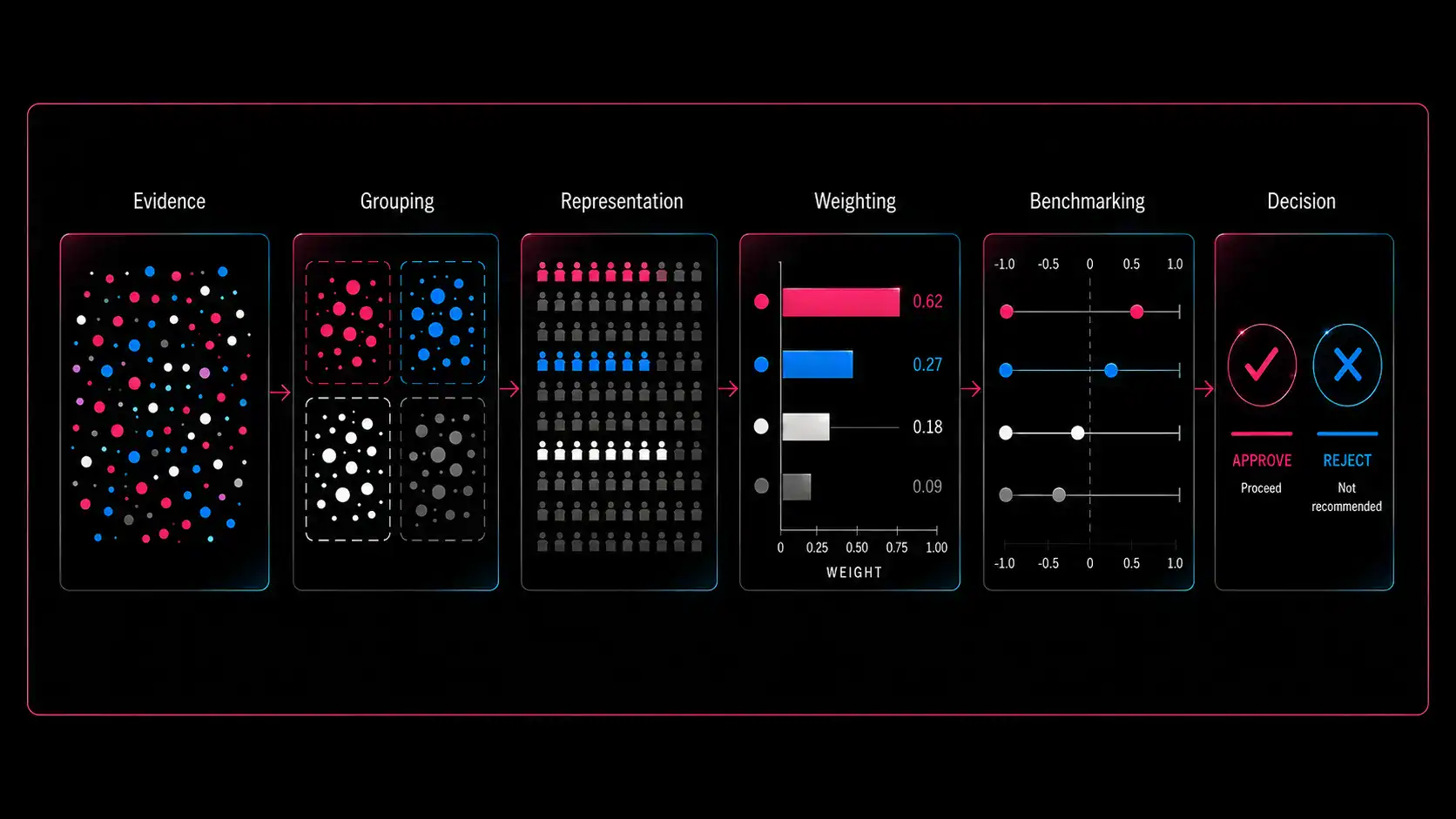
The four cases can be reduced to four interpretive choices that shape what the evidence is able to support.
Four Cases, One Interpretive Problem
Putting the four cases together, I do not see four examples of bad data. I see four different places where meaning enters the analytical process.
The FDA–Sarepta case asks what belongs together. Nielsen asks how those observations should represent a wider population. Klarna asks which measures deserve enough weight to define success. Tesla and Waymo ask against what benchmark performance should be judged.
Grouping. Representation. Weighting. Benchmarking.
These decisions happen at different stages, but they share one characteristic: they shape what the evidence can reasonably support before data-driven decision making begins.
That matters because “data-driven” can easily become shorthand for a decision that has numbers behind it. Numbers behind a decision are not enough on their own. A dataset can be large and still depend on representation assumptions. A metric can be accurate and still be given too much weight. A comparison can use real numbers and still rely on an unsuitable baseline. A safety signal can consist of verified events while its scope depends on how those events are grouped.
None of this makes data arbitrary. The opposite conclusion is more useful. If analytical choices affect what evidence means, then stronger data-driven decision making requires those choices to become more visible. We should be able to ask what was included, what was separated, how the population was represented, which metrics dominated the evaluation, and what benchmark established the comparison. Those questions do not weaken evidence. They tell us what the evidence actually supports.
What I find useful about these four mechanisms is that they are different without being separate. Grouping determines which observations are allowed to form a signal. Representation determines how those observations stand in for a wider population. Weighting determines which measures carry more influence once the evidence is assembled. Benchmarking determines the reference point against which the resulting performance is judged. A weakness at any one of those stages can change the interpretation that follows, even when the underlying observations remain valid.
That is why stronger data-driven decision making depends on more than collecting accurate information or choosing the right metric at the end. It depends on understanding the analytical construction that came before it. The question is not whether interpretation can be removed from the process; in practice, it cannot. The more useful question is whether those interpretive choices are visible enough to examine, challenge, and recalibrate when the evidence no longer supports the conclusion we are drawing from it.
Data-Driven Does Not Mean Interpretation-Free
I began with the idea that the conventional description of data-driven decision making starts too late. Across these cases, the reason becomes clearer. In data-driven decision making, the decision is often the final visible step, and by the time it arrives, much of the interpretive work has already happened. Observations have been grouped. Populations have been modelled. Metrics have been weighted. Benchmarks have been selected. Only then does the evidence arrive in a form that appears ready to guide action.
That does not mean every analytical choice is subjective, or that every interpretation is equally valid. Some groupings are better supported than others. Some models represent populations more accurately. Some metrics matter more to the objective being evaluated. Some benchmarks withstand scrutiny while others do not. The point is that we cannot evaluate those differences if we treat the finished number as though it arrived without an analytical history.
That is the more useful standard for data-driven decision making. Do not only ask what the data says. Ask what has to happen for the data to be able to say it — because the most consequential interpretive decisions often happen before the final number appears.
If you enjoyed this analysis and would like to continue exploring these ideas, subscribe to receive new AnalytIQs+ essays and new publication updates by email.