Information Architecture as a Testable Claim: What California’s Wildfire Recovery Site Revealed
When Available Information Is Still Hard to Locate
A content system can hold the right information and still leave people uncertain about where to look for it. That gap — between what a site contains and what its structure allows people to predict — is where information architecture does most of its work, and it is the part that is easiest to assume rather than test.
California’s wildfire-recovery site makes the gap observable. CA.gov/LAfires launched on January 10, 2025, after the Los Angeles fires, pulling state, local, and federal recovery information into a single service. The challenge was never only publication. It was organizing a large, urgent service environment so that people arriving under pressure could form reliable expectations about where a given piece of information would sit.
What makes the case worth examining closely is that it did not move cleanly from a bad structure to a good one. The team tested an existing structure, considered a different organizing model, generated new categories out of participant research, discovered that one of those new categories was still ambiguous, and refined the structure again. The taxonomy changed, but that is not the durable part. What changed more fundamentally is that the structure became something the team could test rather than defend.
The Structure California Started With
The information-architecture study began with six existing categories: Start your recovery; Get help in person; Get help online; See real-time info; Steps to rebuilding; and Stay healthy.
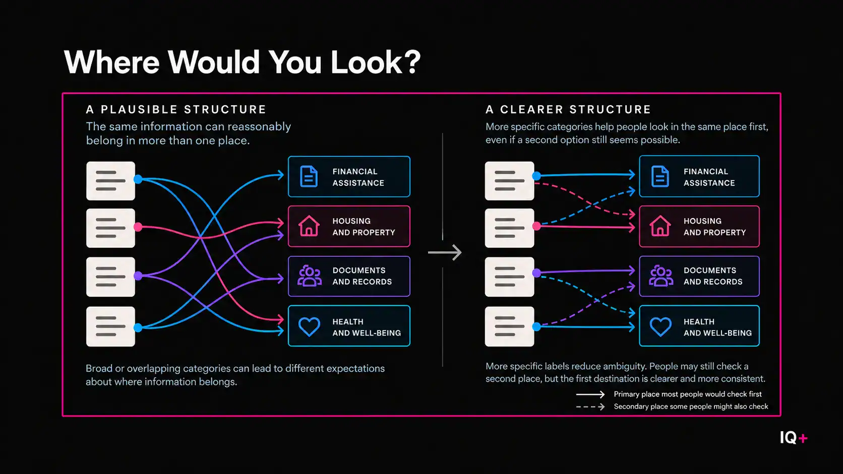
Each of these is understandable on its own. Each points toward some real part of the recovery experience. But they organize information along different dimensions at the same time. Some describe a stage in recovery. Two describe a channel. One describes timing. One describes a subject area. Mixed logic of that kind does not automatically make a structure wrong, but it does create more than one plausible answer to the same question: where should this piece of information belong?
The team tested that question directly with a closed card sort. Fifteen participants placed 37 recovery topics into the six supplied categories. Thirteen of the 37 topics ended up across four or more categories. Only two were reported as consistently placed or grouped.
I want to be careful about what that establishes. A card sort is not observed navigation performance, and these results do not show that people were failing to complete tasks on the live site. What the test did was make one specific problem measurable: participants did not share sufficiently consistent expectations about where much of the information belonged.
That matters because every information architecture makes an implicit prediction. It assumes that when someone encounters a category label, the label will be meaningful enough to narrow the search. If several categories seem equally plausible for the same topic, the hierarchy can remain orderly on paper while becoming difficult to anticipate in use — and the content behind it cannot compensate. A page can be accurate, current, and well written, and none of that helps if the surrounding structure sends people toward three plausible destinations at once.
So the closed sort did more than identify weak labels. It changed the kind of question available to the team. Instead of asking whether the structure seemed reasonable, they could ask whether people expected the same information to appear in the same places. That shift turns information architecture from a design judgment into a claim that can be checked.
The Journey Model and What the Open Sort Showed
One intuitive alternative was to organize recovery information around a journey. Disaster recovery unfolds over time: people move from immediate needs toward replacing documents, securing financial assistance, rebuilding, and longer-term stability. A journey-based navigation structure could plausibly track that sequence more closely than a set of broad service categories.
The evidence bearing on that idea came from an open card sort with 20 new participants working from the same 37 topics. This time participants created their own groups and labels rather than sorting into supplied categories. Only one of the 20 used journey-oriented grouping logic. Most produced more concrete topical groupings.
That is meaningful, and it needs to stay inside its limits.
The card-sort participants were not recruited from the January 2025 Los Angeles wildfire survivor population. The most detailed practitioner account describes participants recruited through a third-party research panel and screened for prior FEMA disaster-assistance experience; a separate anonymized account characterizes them differently, and the public material does not reconcile the two descriptions. What holds across both is the boundary that matters here: this result cannot be reported as “LA wildfire survivors preferred topic-based navigation.”
Nor does it establish that topic-based navigation is generally better than journey-based navigation. No controlled comparison was published in which equivalent users completed equivalent tasks in two fully developed interfaces. What the open sort supports is narrower and, I think, more useful: when this sample was asked to organize recovery topics themselves, journey logic was rarely reproduced spontaneously. The journey model remained a serious hypothesis. It simply was not the organizing logic that participants generated on their own.
“Urgent Help”: When Research-Derived Structure Still Fails the Test
The most revealing part of the case comes next.
The open-sort findings were synthesized into an intermediate structure that included Urgent Help, Financial Assistance, Health & Safety, and Rebuilding. This could easily have been the end of the story. The team had tested the original categories, gathered participant-generated groupings, and built a structure informed by that research. It is the point at which most redesign narratives declare the mental model found.
But one of the new labels still failed. “Urgent Help” remained ambiguous when the revised structure was tested. What counted as urgent depended entirely on the person and the moment. Food could be urgent. Housing could be urgent. Replacing a destroyed document could be urgent. Health could be urgent.
That ambiguity carries weight precisely because “Urgent Help” was not inherited from the original architecture. It emerged from the research process itself. This is where the case breaks out of the familiar framing in which an organization imposes an internal taxonomy and users reveal a truer one. The participant-informed structure was also a hypothesis. Research can generate a better organizational direction without validating the specific labels that come out of it; testing is what determines whether those labels produce sufficiently shared expectations.
The structure was refined again toward more concrete distinctions. The later tested categories included Food & shelter, Health & safety, Pets, Financial assistance, Replace documents, Rebuild your house, and real-time information and updates.
Read against the intermediate version, the shift is not mainly from journey organization to topic organization. It is a shift toward semantic specificity. “Urgent Help” asks the user to interpret a broad condition and decide whether their situation qualifies. “Replace documents” names a bounded need. “Rebuild your house” narrows the destination further. “Pets” is difficult to confuse with financial assistance or document replacement. In this case, the more concrete distinctions coincided with stronger agreement about where information belonged, reducing the amount of interpretation participants had to make about what sat behind a label.
What Changed When the Labels Became More Specific
The project team reported a 394% relative improvement in a card-sort agreement measure concerning where participants expected information to be located. The detailed practitioner account appears to derive that figure from a reported movement from 16% to 79%.
The number needs careful handling, in two directions.
First, it is not a 394% improvement in findability, usability, task completion, decision confidence, or recovery outcomes. The published material does not support any of those readings. It is a practitioner-reported agreement result — a measure of stronger convergence about where information was expected to belong.
Second, there is an unresolved inconsistency in the public record. The same body of project documentation reports that only two of the 37 baseline topics were consistently placed, which is 5.41%, while the account behind the 394% figure uses a 16% baseline. The sources do not explain how the two baseline measures differ, which is reason enough not to treat the headline number as precise.
What survives the qualification is the pattern rather than the percentage. Under the initial structure, placement expectations were widely dispersed across categories. Under the later tested structure, the project team reported substantially greater agreement. That is sufficient to carry the analytical point, and inflating the metric would only make the point easier to dismiss. The meaningful change was not that one navigation philosophy defeated another. It was that the category system became more predictable to the people who tested it.
From Card Sort to Live Content System
The information-architecture work did not stay inside research exercises. According to the practitioner case study, it informed changes to the homepage and secondary pages, the left navigation, a Top Needs module, and updates to the Recovery Services Finder. Current CA.gov pages independently show several of the more concrete labels still in use.
The live system is instructive for a second reason: California did not end with one pure organizing model. The deployed structure is hybrid. Concrete topical categories sit alongside broader recovery groupings, direct routes to in-person help, real-time information, and the Recovery Services Finder. The service offers several different entry points into the same information environment.
I find that more realistic than a clean resolution would have been. Complex public-service information rarely collapses into a single perfect taxonomy. People arrive with different needs, different levels of urgency, different vocabulary, and very different familiarity with government services. A resilient content system may well need more than one dependable route into the same landscape.
The broader program also kept changing after launch, reinforcing a pattern I have examined elsewhere: content debt can emerge when a content system is treated as finished rather than continuously maintained. Official sources describe continued user feedback, Disaster Recovery Center observations, sentiment analysis, survivor research, analytics, and more than 50 enhancements in the first month. Those changes cannot be attributed to the card-sort work, and program-level outcomes — traffic, satisfaction, reported reductions in support inquiries — cannot be treated as effects of the information architecture. What they do establish is that this structure lived inside a service that continued to be observed and recalibrated rather than declared finished at publication.
Why Information Architecture Is Part of Information Delivery
The larger content-systems lesson I take from this case concerns where we locate the boundary of “content.”
Information architecture is often treated as a layer around content, even though content architecture is part of what allows that content to function. The writing is the information; the navigation is the container. That separation holds until someone has to locate one relevant item among hundreds. Before a page can be read, understood, compared, or acted on, it has to be found — and the surrounding hierarchy shapes whether the user looks in the right place first, recognizes the category as relevant, and keeps moving toward what they need.
This does not mean structure determines the decision at the end of that path. California’s study did not measure decision confidence, and I would not claim that clearer categories produced more confident recovery decisions. The evidence supports a narrower and more defensible relationship: information architecture shapes one condition that precedes informed action, which is whether relevant information can be predictably located. That is an upstream function, and it is enough.
When a structure sends plausible signals toward several destinations at once, uncertainty enters before the user reaches any content at all. When categories generate stronger shared expectations, the user has a more stable path into the system. Which is why information hierarchy should not be evaluated only by internal coherence. A taxonomy can appear logical to the people who built it and still produce dispersed expectations when tested. The test is not whether the organization can explain the hierarchy. It is whether the hierarchy produces useful expectations for the people using it.
Structure as a Testable Claim
Every information architecture makes a prediction about where people will expect content to be. What California’s case demonstrates is what happens when that prediction is tested instead of assumed — and how much the testing can still reveal after the obvious problems have been fixed.
The sequence matters more than any individual category. A plausible taxonomy is a hypothesis. User research generates alternative hypotheses. Testing determines whether those structures produce sufficiently convergent expectations. And, as “Urgent Help” showed, categories drawn from research can fail that test as readily as categories drawn from an org chart. Provenance is not predictability.
That is a demanding standard, and it is a more honest one than the redesign story it replaces. It does not let a structure pass because it can be defended in a meeting, and it does not let one pass merely because users were consulted somewhere upstream. It asks for evidence that people converge on where things belong — which is something an organization can actually observe, and go on observing as a service changes.
California’s wildfire-recovery site does not establish a universal navigation model, and it was never going to. It establishes something more portable: an information architecture becomes defensible when it is treated as a testable claim rather than as settled logic.